
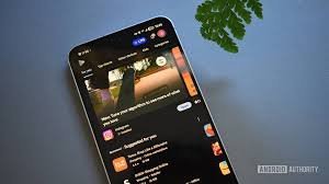
Google Play Store Redesign: Everything You Need to Know About the New Look
Have you noticed something different the last time you went to download a new app or update your favorite game? If so, you aren’t imagining it. Google is currently rolling out a significant UI redesign for the Play Store, bringing a fresher, more modern aesthetic to one of the most visited apps on Android.
This update focuses on streamlining the user experience, making navigation more intuitive, and aligning the marketplace with Google’s current Material Design language. Let’s dive into the specific changes you’ll notice.
A Fresh Face for Games and Apps
The most prominent changes are concentrated within the Games and Apps tabs. While the Books section remains untouched for now, the rest of the marketplace is getting a makeover. Here is what has changed:
- Pill-Shaped Navigation: The traditional tabs have been replaced by sleek, pill-shaped containers, giving the interface a softer and more contemporary feel.
- Simplified Home Screen: The previously separate “For you” tab has been removed. Instead, it now serves as the default home page for both the Games and Apps sections, ensuring personalized recommendations are the first thing you see.
- New Page Architecture: Tapping on “Top charts” or “Categories” no longer simply scrolls the page; it now opens a dedicated separate page. To return to the main hub, you’ll simply use the back arrow in the top left corner.
Subtle Tweaks: Play Points and Notifications
Beyond the layout of the main tabs, Google has also tweaked some of the functional elements of the Google Play Store to clean up the visual clutter.
Google Play Points: Previously, your loyalty points were displayed in a prominent blue pill-shaped container at the top of the screen. In the latest version, this container has been removed, integrating your rewards more subtly into the overall profile and account settings.
Notification Badges: Users have also spotted a new style for badge notifications, ensuring that alerts are more visible yet less intrusive, maintaining a clean user interface.
Is This Update Good for Users?
By making the “For you” section the default, Google is leaning heavily into AI-driven personalization. While some users might miss the old layout, the transition to dedicated pages for charts and categories allows for a more focused browsing experience.
Whether you are a hardcore gamer or someone who just needs the latest productivity tool, these changes aim to make the Play Store feel faster and more modern. If you haven’t seen these changes yet, don’t worry—the rollout is happening in stages across various Android devices.
What do you think about the new Google Play Store look? Do you prefer the pill-shaped tabs or the classic layout? Let us know in the comments!