The Great Map Shift: Why the World Map of Africa is Finally Being Corrected
For centuries, the way we perceive the globe has been skewed. Most of us grew up staring at a world map where Greenland appears nearly as large as Africa. However, in reality, Africa is approximately 14 times larger than Greenland. This isn’t just a minor drawing error; it’s a systemic distortion that shapes our global subconscious.
In a landmark move, the UN General Assembly has voted to move away from traditional representations in favour of maps that more accurately reflect the true scale of the African continent. This initiative, known as the “Correct the Map” resolution, marks a pivotal shift toward what advocates call “cognitive justice.”
The Mercator Problem: A Legacy of Distortion
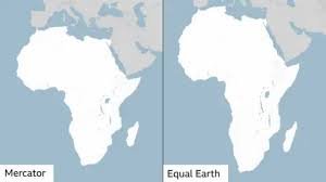
The map most of us are familiar with is the Mercator projection, created in 1569 by Flemish cartographer Gerardus Mercator. While it was an ingenious tool for 16th-century European explorers to navigate the oceans, it was never intended to be a precise representation of landmass area.
- The Technical Glitch: Because it is impossible to flatten a 3D sphere onto a 2D surface without distortion, the Mercator map stretches areas as they move away from the equator toward the poles.
- The Perception Gap: This makes Northern Hemisphere countries look disproportionately large, while equatorial regions, particularly Africa and South America, appear shrunk.
- The Real-World Impact: Critics argue that by minimizing the size of Africa, the map implicitly minimizes the importance, development needs, and potential of the nations within it.
The Rise of the Equal Earth Projection
To combat this narrative, a team of cartographers introduced the Equal Earth projection in 2018. Unlike the Mercator, this projection ensures that the area of each landmass is represented accurately relative to others.
The African Union (AU), comprising 54 member states, has officially adopted this model, stating that it provides a far more honest depiction of the world. To put the scale into perspective, the world map of Africa is so vast that you could fit the United States, China, India, Japan, Mexico, and most of Europe inside its borders and still have room to spare.
A Diplomatic Tug-of-War at the UN
The resolution was sponsored by Togo and backed by the AU, passing with an overwhelming majority of 164 nations, including the UK and France. However, the transition has not been without controversy:
- The Supporters: Togolese Foreign Minister Robert Dussey emphasized that “a fair world begins with a fair map,” arguing that maps are never neutral—they shape how we understand people and power.
- The Opposition: The United States was the sole nation to vote against the resolution, with US representatives arguing that the UN should focus on international peace and prosperity rather than “map projects from the 16th Century.”
Why This Matters for the Future
Correcting the world map of Africa is about more than just geography; it is about economic and political perception. As Kenyan geographer Kioko Muendo points out, distorted maps downplay Africa’s vast resources, growing population, and investment opportunities.
By aligning our visual representations with reality, the global community takes a step toward dismantling long-standing misinformation and acknowledging the true geopolitical weight of the African continent.
To learn more about how global governance works and current international resolutions, visit the official United Nations website.